CSS의 속성값을 기정할 때도 함수 개념을 적용할 수 있다. CSS의 함수는 괄화 안에 인수를 전달하면, 인수에 따른 결과값을 속성에 적용하는 방식으로 작동한다.
CSS 함수의 대표선수 calc()
CSS 함수의 calc()를 이용하면 계산식의 결과를 속성값으로 지정할 수 있다. calc() 함수는 괄호 안에 표현식 하나를 받고, 표현식의 결과가 최종 값이 된다. 표현식은 단순 계산이면 무엇이든 가능하다.
예를 들어, width: calc(30px - 20px) 이런 식이다.
<!DOCTYPE html>
<html lang="en">
<head>
    <meta charset="UTF-8">
    <meta http-equiv="X-UA-Compatible" content="IE=edge">
    <meta name="viewport" content="width=device-width, initial-scale=1.0">
    <title>calc 함수</title>
    <style>
        .message{
            display: flex;
            justify-content: space-around; /*좌우로 여백을 두고 펼처진다*/
            align-items: center;
            height: 100px;
            padding: 0.5em;
            border: 1px solid #000;
            font-size: 1.5em;
        }
        .message_text{
            width: 80%;
            height: 100%;
            border: none;
            resize: none;
        }
        .message_text:focus{outline:none;}
        .message_send{
            width: 20%;
            height: 100%;
            border-radius: 8px;
            background-color: #9ec4cf;
        }

    </style>
</head>
<body>
    <div class="mass">
        <textarea class="message_text" name="" id="" cols="30" rows="10"></textarea>
        <button class="message_send">전송</button>
    </div>
</body>
</html>
위 코드를 브라우저에서 확인해보면 브라우저의 크기가 커질수록 전송 버튼의 크기가 늘어나게 된다.

전송 버튼의 크기를 고정해보자.
<!DOCTYPE html>
<html lang="en">
<head>
    <meta charset="UTF-8">
    <meta http-equiv="X-UA-Compatible" content="IE=edge">
    <meta name="viewport" content="width=device-width, initial-scale=1.0">
    <title>calc 함수</title>
    <style>
        .message{
            display: flex;
            justify-content: space-around; /*좌우로 여백을 두고 펼처진다*/
            align-items: center;
            height: 100px;
            padding: 0.5em;
            border: 1px solid #000;
            font-size: 1.5em;
        }
        .message_text{
            width: 80%;
            height: 100%;
            border: none;
            resize: none;
        }
        .message_text:focus{outline:none;}
        .message_send{
            width: 100px;
            height: 100%;
            border-radius: 8px;
            background-color: #9ec4cf;
        }

    </style>
</head>
<body>
    <div class="mass">
        <textarea class="message_text" name="" id="" cols="30" rows="10"></textarea>
        <button class="message_send">전송</button>
    </div>
</body>
</html>
전송 버튼의 크기를 100px로 고정했다. 이렇게 했을 경우 브라우저의 크기가 커졌을때 message_text 의 크기 80%와 전송 버튼의 100px을 뺀 나머지 부분이 빈 영역으로 존재하게 된다.
예상하지 않던 여백이 생긴 것이다. 이럴때 calc() 함수를 사용할 수 있다.
<!DOCTYPE html>
<html lang="en">
<head>
    <meta charset="UTF-8">
    <meta http-equiv="X-UA-Compatible" content="IE=edge">
    <meta name="viewport" content="width=device-width, initial-scale=1.0">
    <title>calc 함수</title>
    <style>
        .message{
            display: flex;
            justify-content: space-around; /*좌우로 여백을 두고 펼처진다*/
            align-items: center;
            height: 100px;
            padding: 0.5em;
            border: 1px solid #000;
            font-size: 1.5em;
        }
        .message_text{
            width: calc(100% - 100px); /*전송 버튼을 뺀 나머지 부분을 모두 차지한다*/
            height: 100%;
            border: none;
            resize: none;
        }
        .message_text:focus{outline:none;}
        .message_send{
            width: 100%;
            height: 100%;
            border-radius: 8px;
            background-color: #9ec4cf;
        }

    </style>
</head>
<body>
    <div class="mass">
        <textarea class="message_text" name="" id="" cols="30" rows="10"></textarea>
        <button class="message_send">전송</button>
    </div>
</body>
</html>
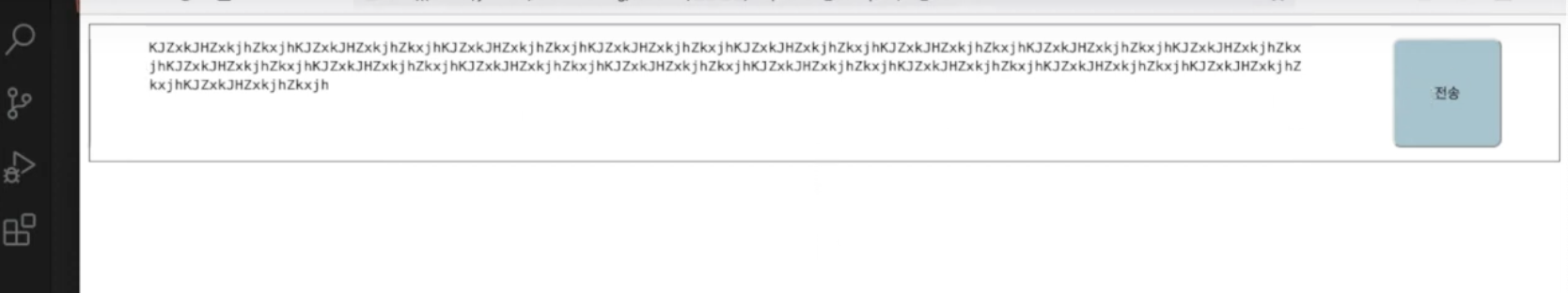
message_text 의 크기를 변경했다.

위에서 봤던 것과는 다르게 브라우저의 크기를 늘려도 불필요한 여백이 생기지 않았다.
정리

'Front-End > 반응형 웹' 카테고리의 다른 글
| 반응형 웹(7) - 가변 이미지 (2) | 2024.07.18 |
|---|---|
| 반응형 웹(6) - 미디어 쿼리 (0) | 2024.07.17 |
| 반응형 웹(4) - 가변형 레이아웃 (2) | 2024.07.14 |
| 반응형 웹(3) - 다양한 상대 단위 (0) | 2024.07.13 |
| 반응형 웹(2) em & rem (0) | 2024.07.09 |