절대 길이 단위 px
입문 레벨에서 가장 많이 사용하는 단위인 px(픽셀)은 절대 길이 단위이다. px은 어떤 상황에서도 동일한 값을 유지하므로 가변성이 없다.

em과 rem
em과 rem은 박스에서 텍스트 크기를 조정할 때 사용하는 상대 단위이다. em은 부모 요소의 글꼴 크기를, rem은 루트 요소의 글꼴 크기를 의미한다.
<div style="font-size: 20px;">
	<p>자식 요소의 1em은 20px!</p>
    <p>자식 요소의 2em은 40px!</p>
</div>
루트 요소는 <html> 요소를 말하는 것이며 루트 요소 글자 크기 기본값은 16px이다.
em으로 내, 외부 여백 크기를 정할 때는 자기 자신의 글자 크기를 기준으로 한다.
다음예시를 보자
<!DOCTYPE html>
<html lang="en">
  <head>
    <meta charset="UTF-8" />
    <meta http-equiv="X-UA-Compatible" content="IE=edge" />
    <meta name="viewport" content="width=device-width, initial-scale=1.0" />
    <title>em과 rem</title>
    <style>
      .inner {
        display: inline-block;
        width: 200px;
        height: 200px;
        background-color: tomato;
      }
    </style>
  </head>
  <body>
    <div class="outer">
      <div class="inner">고양이</div>
    </div>
  </body>
</html>
해당 html 문서를 확인해 보면 '고양이'는 16px로 표시되는 것을 확인할 수 있다.
그렇다면 다음의 경우는 어떨까?
<!DOCTYPE html>
<html lang="en">
  <head>
    <meta charset="UTF-8" />
    <meta http-equiv="X-UA-Compatible" content="IE=edge" />
    <meta name="viewport" content="width=device-width, initial-scale=1.0" />
    <title>em과 rem</title>
    <style>
      .outer {
        font-size: 24px;
      }
      .inner {
        display: inline-block;
        width: 200px;
        height: 200px;
        background-color: tomato;
      }
    </style>
  </head>
  <body>
    <div class="outer">
      <div class="inner">고양이</div>
    </div>
  </body>
</html>
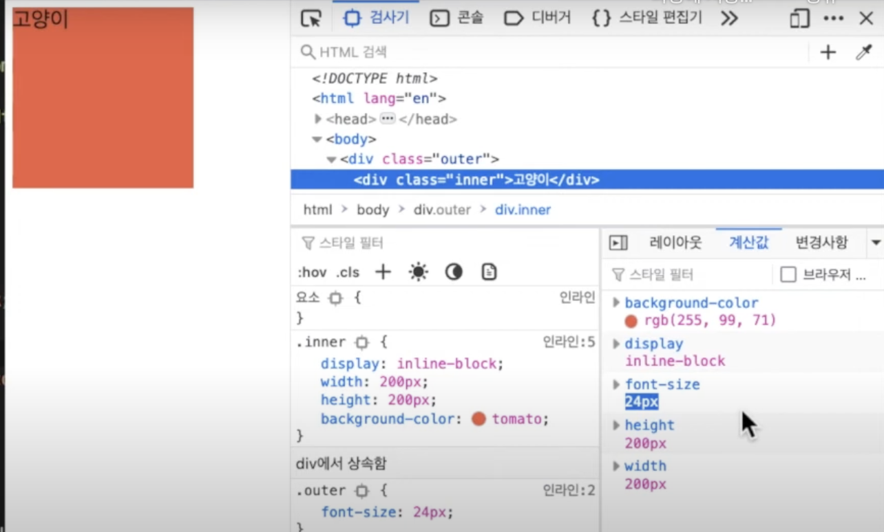
outer 클래스의 글자 크기를 24px로 설정했기 때문에 자식 요소의 글자인 '고양이'도 24px로 표시되는 것을 확인할 수 있다.
em을 한번 살펴보자
<!DOCTYPE html>
<html lang="en">
  <head>
    <meta charset="UTF-8" />
    <meta http-equiv="X-UA-Compatible" content="IE=edge" />
    <meta name="viewport" content="width=device-width, initial-scale=1.0" />
    <title>em과 rem</title>
    <style>
      .outer {
        font-size: 24px;
      }
      .inner {
          font-size: 2em; /*글자 크기가 48px로 커진다.*/
        display: inline-block;
        width: 200px;
        height: 200px;
        background-color: tomato;
      }
    </style>
  </head>
  <body>
    <div class="outer">
      <div class="inner">고양이</div>
    </div>
  </body>
</html>
자식요소인 inner 클래스에서 글자 크기를 2em으로 설정하게 되면 부모요소인 outer 클래스의 글자 크기가 24px이기 때문에 2배인 48px이 되는 것을 확인할 수 있다.
rem은 어떨까
<!DOCTYPE html>
<html lang="en">
  <head>
    <meta charset="UTF-8" />
    <meta http-equiv="X-UA-Compatible" content="IE=edge" />
    <meta name="viewport" content="width=device-width, initial-scale=1.0" />
    <title>em과 rem</title>
    <style>
      .outer {
        font-size: 24px;
      }
      .inner {
          font-size: 1rem; /*html 요소의 값을 기준으로 설정된다 기본값인 16px로 설정된다.*/
        display: inline-block;
        width: 200px;
        height: 200px;
        background-color: tomato;
      }
    </style>
  </head>
  <body>
    <div class="outer">
      <div class="inner">고양이</div>
    </div>
  </body>
</html>
여기서 html style="font-size: 20px;"로 설정하게 되면 20px로 설정되는 것을 확인할 수 있다.
padding 과 margin에 대해서도 확인해보자
<!DOCTYPE html>
<html lang="en">
  <head>
    <meta charset="UTF-8" />
    <meta http-equiv="X-UA-Compatible" content="IE=edge" />
    <meta name="viewport" content="width=device-width, initial-scale=1.0" />
    <title>em과 rem</title>
    <style>
      .outer {
        font-size: 24px;
      }
      .inner {
          font-size: 1rem; /*html 요소의 값을 기준으로 설정된다 기본값인 16px로 설정된다.*/
        display: inline-block;
        width: 200px;
        height: 200px;
        background-color: tomato;
        margin: 1rem;
        padding: 1rem;
      }
    </style>
  </head>
  <body>
    <div class="outer">
      <div class="inner">고양이</div>
    </div>
  </body>
</html>
padding과 margin을 1rem으로 설정한 경우 기본값인 16px인 것을 확인할 수 있다.
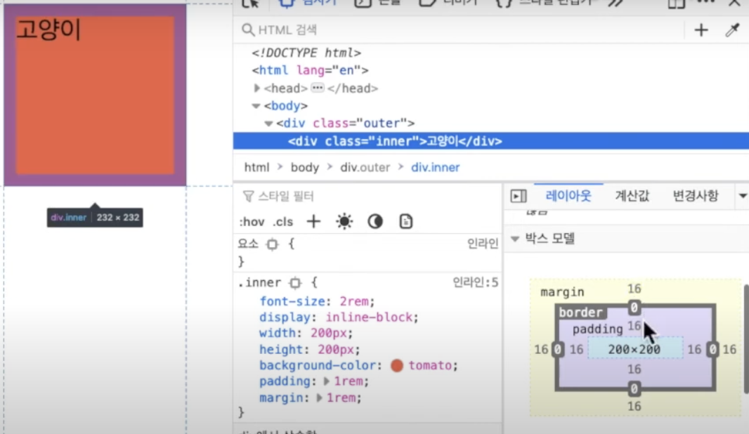
em은 어떨까?
<!DOCTYPE html>
<html lang="en">
  <head>
    <meta charset="UTF-8" />
    <meta http-equiv="X-UA-Compatible" content="IE=edge" />
    <meta name="viewport" content="width=device-width, initial-scale=1.0" />
    <title>em과 rem</title>
    <style>
      .outer {
        font-size: 32px;
      }
      .inner {
          font-size: 16px; /*html 요소의 값을 기준으로 설정된다 기본값인 16px로 설정된다.*/
        display: inline-block;
        width: 200px;
        height: 200px;
        background-color: tomato;
        margin: 1em;
        padding: 1em;
      }
    </style>
  </head>
  <body>
    <div class="outer">
      <div class="inner">고양이</div>
    </div>
  </body>
</html>
자기 자신에 대한 padding과 margin을 설정한 경우 부모의 글자 크기로 설정하는 것이 아닌 자기 자신을 기준으로 글자 크기를 설정한다.
따라서 위와 같이 설정한 경우 padding과 margin은 16px이 된다.
<!DOCTYPE html>
<html lang="en">
  <head>
    <meta charset="UTF-8" />
    <meta http-equiv="X-UA-Compatible" content="IE=edge" />
    <meta name="viewport" content="width=device-width, initial-scale=1.0" />
    <title>em과 rem</title>
    <style>
      .outer {
        font-size: 32px;
      }
      .inner {
          font-size: 1em; /*html 요소의 값을 기준으로 설정된다 기본값인 16px로 설정된다.*/
        display: inline-block;
        width: 200px;
        height: 200px;
        background-color: tomato;
        margin: 1em;
        padding: 1em;
      }
    </style>
  </head>
  <body>
    <div class="outer">
      <div class="inner">고양이</div>
    </div>
  </body>
</html>
위와 같이 font-size: 1em; 으로 변경한 경우 32px로 변경되기 때문에 padding과 margin 또한 32px로 변경된다.
정리

'Front-End > 반응형 웹' 카테고리의 다른 글
| 반응형 웹(6) - 미디어 쿼리 (0) | 2024.07.17 |
|---|---|
| 반응형 웹(5) - calc() (0) | 2024.07.15 |
| 반응형 웹(4) - 가변형 레이아웃 (2) | 2024.07.14 |
| 반응형 웹(3) - 다양한 상대 단위 (0) | 2024.07.13 |
| 반응형 웹(1) (0) | 2024.07.08 |