em을 이용해 상대적인 크기의 폰트를 적용할 때처럼, 레이아웃에도 비율에 기반한 개념을 적용할 수 있다.
부모 요소의 크기에 비례해 자식 요소의 크기가 변하는 방식은 가변 레이아웃을 만들 때 흔히 사용되는 방식이다.
그럴 때 사용되는 상대적이고 비례적인 단위는 바로 % (퍼센트) 이다.
%
% 단위는 백분율 값을 나타낸다. 보통 부모 요소와의 상대적 크기를 지정할때 사용한다. 너비와 높이, 여백 뿐 아니라 글자 크기에도 사용할 수 있다.
/* 부모 요소의 글자 크기가 100% */
font-size: 50%;

/* 부모 요소의 높이가 100% */
height: 50%;

/* 부모 요소의 너비가 100% */
width: 50%;
margin: 50%;
padding: 10%;
아래의 코드로 연습을 해보자
<!DOCTYPE html>
<html lang="en">
<head>
    <meta charset="UTF-8">
    <meta http-equiv="X-UA-Compatible" content="IE=edge">
    <meta name="viewport" content="width=device-width, initial-scale=1.0">
    <title>가변 레이아웃</title>
    <style>
        .container {
            width: 960px;
            margin: 0 auto;
            text-align: center;
        }
        .header{
            width: 960px;
            height: 100px;
            background-color: tomato;
        }
        .main{
            float: left;
            width: 640px;
            height: 300px;
            background-color: orange;
        }
        .asdie{
            float: right;
            width: 320px;
            height: 300px;
            background-color: purple;
        }
        .footer{
            clear: both; /*float으로 인해 문맥이 흐트러지는 것을 방지*/
            width: 960px;
            height: 100px;
            background-color: violet;
        }
    </style>
</head>
<body>
    <div class="container">
        <div class="header">HEADER</div>
        <div class="main">MAIN</div>
        <div class="aside">ASIDE</div>
        <div class="footer">FOOTER</div>
    </div>
</body>
</html>
위 레이아웃은 960px; 이라는 고정 크기를 가지고 있다. 그래서 960px; 보다 작은 화면을 만나게 되면 요소가 가려지게 된다.
이때 사용하면 좋은것이 가변레이아웃 % 이다.
<!DOCTYPE html>
<html lang="en">
<head>
    <meta charset="UTF-8">
    <meta http-equiv="X-UA-Compatible" content="IE=edge">
    <meta name="viewport" content="width=device-width, initial-scale=1.0">
    <title>가변 레이아웃</title>
    <style>
        .container {
            width: 90%;
            margin: 0 auto;
            text-align: center;
        }
        .header{
            width: 100%;
            height: 100px;
            background-color: tomato;
        }
        .main{
            float: left;
            width: 640px;
            height: 300px;
            background-color: orange;
        }
        .asdie{
            float: right;
            width: 320px;
            height: 300px;
            background-color: purple;
        }
        .footer{
            clear: both; /*float으로 인해 문맥이 흐트러지는 것을 방지*/
            width: 100%;
            height: 100px;
            background-color: violet;
        }
    </style>
</head>
<body>
    <div class="container">
        <div class="header">HEADER</div>
        <div class="main">MAIN</div>
        <div class="aside">ASIDE</div>
        <div class="footer">FOOTER</div>
    </div>
</body>
</html>
가장 부모 요소인 container 를 90% 로 설정해보자
960px 이었을때 동일하게 960px을 가지고 있던 header, footer 를 100% 로 설정할 수 있다.
main과 aside도 동일하게 % 단위로 변경해보자.
<!DOCTYPE html>
<html lang="en">
<head>
    <meta charset="UTF-8">
    <meta http-equiv="X-UA-Compatible" content="IE=edge">
    <meta name="viewport" content="width=device-width, initial-scale=1.0">
    <title>가변 레이아웃</title>
    <style>
        .container {
            width: 90%;
            margin: 0 auto;
            text-align: center;
        }
        .header{
            width: 100%;
            height: 100px;
            background-color: tomato;
        }
        .main{
            float: left;
            width: 67%;
            height: 300px;
            background-color: orange;
        }
        .asdie{
            float: right;
            width: 33%;
            height: 300px;
            background-color: purple;
        }
        .footer{
            clear: both; /*float으로 인해 문맥이 흐트러지는 것을 방지*/
            width: 100%;
            height: 100px;
            background-color: violet;
        }
    </style>
</head>
<body>
    <div class="container">
        <div class="header">HEADER</div>
        <div class="main">MAIN</div>
        <div class="aside">ASIDE</div>
        <div class="footer">FOOTER</div>
    </div>
</body>
</html>
이렇게 변경하면

브라우저 창이 작아져도 레이아웃을 유지하는 것을 확인할 수 있다.
<!DOCTYPE html>
<html lang="en">
<head>
    <meta charset="UTF-8">
    <meta http-equiv="X-UA-Compatible" content="IE=edge">
    <meta name="viewport" content="width=device-width, initial-scale=1.0">
    <title>가변 레이아웃</title>
    <style>
        *{ box-sizing: border-box;}
        .container {
            width: 90%;
            margin: 0 auto;
            text-align: center;
        }
        .header{
            width: 100%;
            height: 100px;
            background-color: tomato;
        }
        .main{
            float: left;
            width: 67%;
            height: 300px;
            padding: 10%;
            background-color: orange;
        }
        .asdie{
            float: right;
            width: 33%;
            height: 300px;
            padding: 10%;
            background-color: purple;
        }
        .footer{
            clear: both; /*float으로 인해 문맥이 흐트러지는 것을 방지*/
            width: 100%;
            height: 100px;
            background-color: violet;
        }
    </style>
</head>
<body>
    <div class="container">
        <div class="header">HEADER</div>
        <div class="main">MAIN</div>
        <div class="aside">ASIDE</div>
        <div class="footer">FOOTER</div>
    </div>
</body>
</html>
위와 같이 padding: 10%; 로 줘보자

그러면 부모 요소인 container 너비를 기준으로 10% 의 padding 크기를 갖는걸 확인할 수 있다.
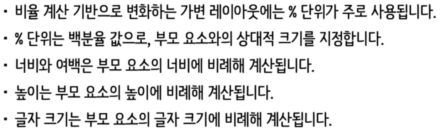
정리
'Front-End > 반응형 웹' 카테고리의 다른 글
| 반응형 웹(6) - 미디어 쿼리 (0) | 2024.07.17 |
|---|---|
| 반응형 웹(5) - calc() (0) | 2024.07.15 |
| 반응형 웹(3) - 다양한 상대 단위 (0) | 2024.07.13 |
| 반응형 웹(2) em & rem (0) | 2024.07.09 |
| 반응형 웹(1) (0) | 2024.07.08 |